02 · Logo System
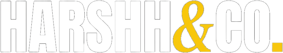
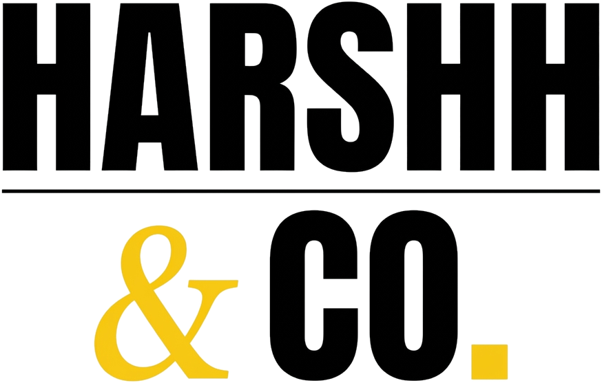
The mark is a double-h wordmark. Treat the spelling as the signature.
Always written HARSHH with two H letters at the end. Always with the italic Fraunces serif ampersand in yellow. Never simplified, never re-styled.
Primary Wordmark
PRIMARY · DARK
PRIMARY · LIGHT
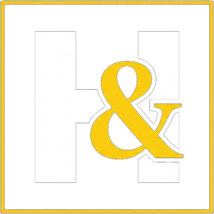
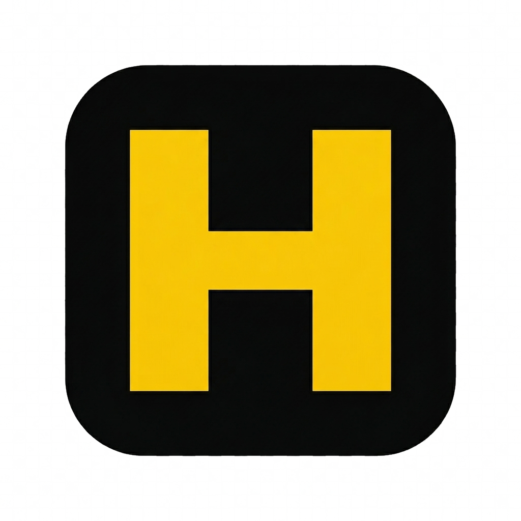
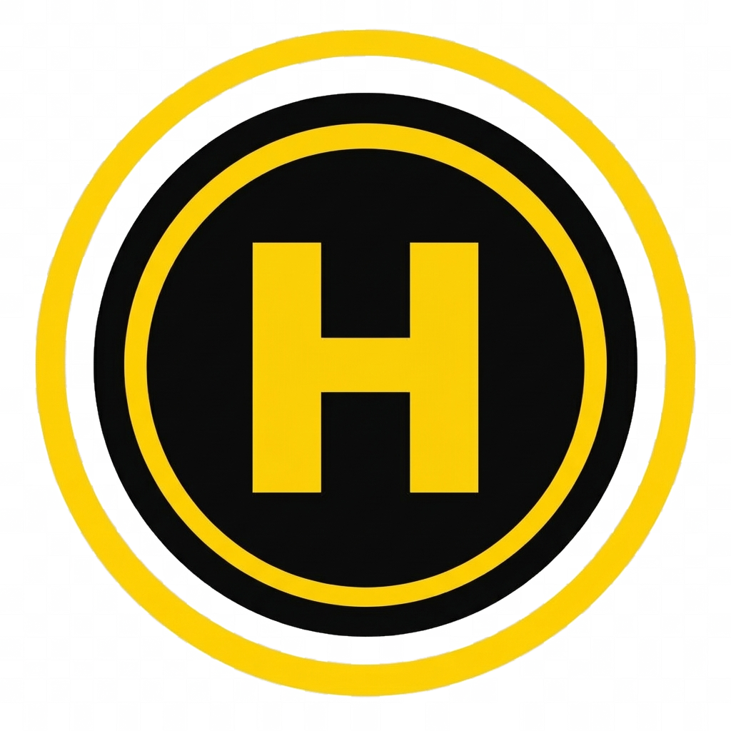
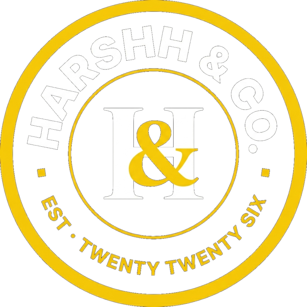
Stacked · Monogram · App Icon · Avatar · Seal
STACKED

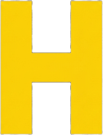
MONOGRAM
APP ICON
AVATAR
Founder Seal · Email Signature · Favicon Mark
SEAL
EMAIL SIGNATURE

FAVICON MARK
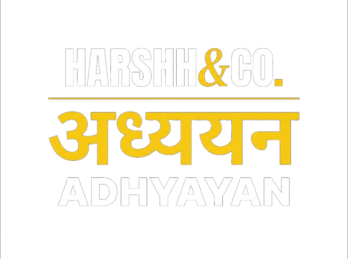
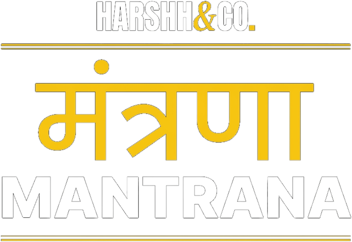
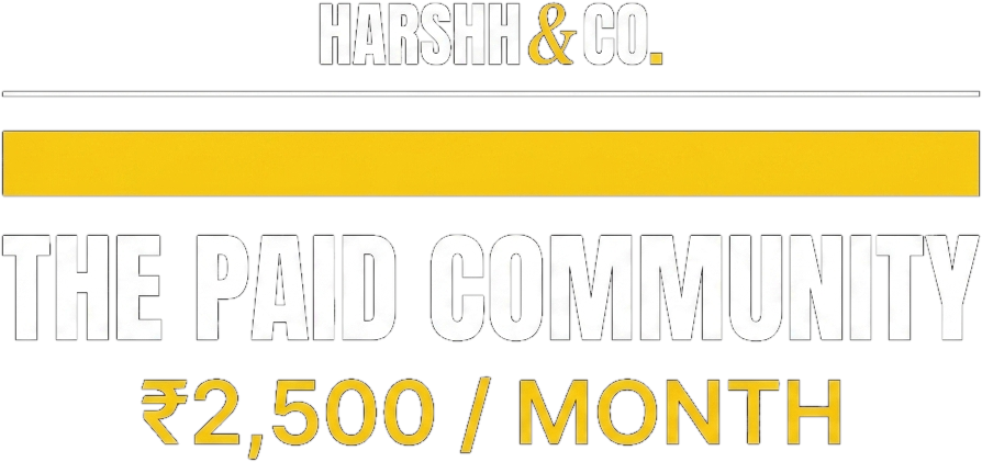
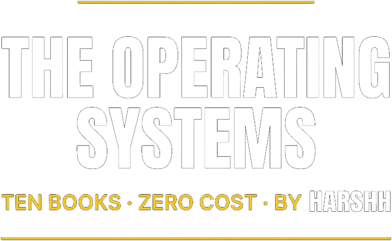
Sub-Brand Lockups
ADHYAYAN
MANTRANA
DONE FOR YOU

PAID COMMUNITY
FREE COMMUNITY

OPERATING SYSTEMS
Clear Space & Sizing Rules
Clear Space
Minimum padding around any logo equals the cap-height of the letter "H" in that lockup. No type, image, or edge inside that buffer.
Minimum Size
Primary wordmark: 96 px wide on screen, 24 mm wide in print. Monogram: 32 px on screen. Below that, switch to the favicon.
Color Lock
HARSHH and CO. always read in pure white or pure black. The ampersand and the trailing square dot are always yellow #FFD60A. No exceptions.
Do & Do Not
Use on pure black or pure white only
Backgrounds outside the system dilute the mark. Photo backgrounds need a solid plate behind the wordmark.
Never recolour the wordmark glyphs
No green HARSHH, no red CO., no rainbow ampersand. The yellow accent is the only accent.
Keep the double H spelling intact
HARSHH always reads with two H letters at the end. Spell-checkers are wrong.
Never replace the ampersand with "and"
The ampersand is part of the visual identity. Spelling it out kills the mark.
Use the italic Fraunces ampersand only
A geometric or sans ampersand breaks the editorial-meets-DR feel. Always italic serif.
Never add a tagline lockup to the logo
Taglines belong in the layout, not inside the mark itself.
Use the monogram for tight squares
Avatars, app icons, podcast tiles, founder merch tags.
Never apply shadows, glows, or gradients
The mark is flat vector. Effects look cheap and break the system.